How To Make Animation Button Hover Using CSS Part 4
 Posted By
Bajarangi soft
Posted By
Bajarangi soft ,
Posted On 27-01-2021
The first thing is to create a border with a transparent background. Then animate it over hover giving it a linear animation and an identifier name as animate. Now using keyframes we will animate the border. Make sure to apply color to only the top and right side of the border.
Step 1:Create css file like style.css.
@import url("https://fonts.googleapis.com/css2?family=Roboto:ital,wght@0,100;0,300;0,400;1,100;1,300&family=Slabo+27px&display=swap");
*::after,
*::before {
box-sizing: border-box;
}
html {
scroll-behavior: smooth;
}
body {
margin: 0px;
padding: 0px;
}
ul,
li {
margin: 0px;
padding: 0px;
list-style: none;
font-family: "Roboto", sans-serif;
font-style: normal;
}
h1,
h2,
h3,
h4,
h5,
h6 {
margin: 0px;
padding: 0px;
font-weight: 500;
font-family: "Roboto", sans-serif;
font-style: normal;
}
p {
margin: 0px;
padding: 0px;
font-family: "Roboto", sans-serif;
font-style: normal;
}
table,
thead,
tbody,
tr,
th,
td {
font-family: "Roboto", sans-serif;
font-style: normal;
}
hr {
margin: 0px;
padding: 0px;
}
input,
button,
select,
optgroup,
textarea {
font-family: "Roboto", sans-serif;
font-style: normal;
}
a,
strong,
label,
span,
img,
b {
font-family: "Roboto", sans-serif;
transition: all 0.3s ease 0s;
font-style: normal;
}
a,
a:hover,
a:focus,
a:active,
a:link {
outline: none;
text-decoration: none;
color: #000;
}
a.bs-btn:focus {
outline: 0;
box-shadow: none;
}
button.bs-btn:focus {
outline: 0;
box-shadow: none;
}
Step 2:Create html file like button-eight.html and import style.css in it.
<!DOCTYPE html>
<html lang="en">
<head>
<!-- Required meta tags -->
<title>animaion button three</title>
<meta charset="utf-8" />
<meta name="viewport" content="width=device-width, initial-scale=1, shrink-to-fit=no" />
<!-- Bootstrap CSS -->
<link rel="stylesheet" href="https://maxcdn.bootstrapcdn.com/bootstrap/4.0.0/css/bootstrap.min.css">
<link rel="stylesheet" href="https://cdnjs.cloudflare.com/ajax/libs/font-awesome/4.7.0/css/font-awesome.min.css">
<link rel="stylesheet" type="text/css" href="css/style.css" />
<style type="text/css">
button.bs-btn {
position: relative;
display: inline-block;
min-width: 170px;
max-width: 170px;
padding: 14px 0px;
background: none;
vertical-align: middle;
-webkit-backface-visibility: hidden;
-moz-osx-font-smoothing: grayscale;
border: 2px solid;
border-radius: 40px;
font-size: 14px;
font-weight: 600;
text-transform: uppercase;
letter-spacing: 1px;
border-color: #c01a37;
cursor: pointer;
color: #c01a37;
z-index: 1;
margin: 3px 0px;
}
button.bs-btn:focus {
outline: none;
}
button.bs-btn > span {
vertical-align: middle;
}
button.bs-btn.btn-hover {
-webkit-transition: border-color 0.4s, color 0.4s;
transition: border-color 0.4s, color 0.4s;
}
button.bs-btn.btn-hover::before {
content: "";
position: absolute;
top: 0;
left: 0;
width: 100%;
height: 100%;
background: #c01a37;
z-index: -1;
opacity: 0;
-webkit-transform: scale3d(0.7, 1, 1);
transform: scale3d(0.7, 1, 1);
-webkit-transition: -webkit-transform 0.4s, opacity 0.4s;
transition: transform 0.4s, opacity 0.4s;
-webkit-transition-timing-function: cubic-bezier(0.2, 1, 0.3, 1);
transition-timing-function: cubic-bezier(0.2, 1, 0.3, 1);
border-radius: 40px;
}
button.bs-btn.btn-hover,
button.bs-btn.btn-hover::before {
-webkit-transition-timing-function: cubic-bezier(0.2, 1, 0.3, 1);
transition-timing-function: cubic-bezier(0.2, 1, 0.3, 1);
}
button.bs-btn.btn-hover:hover {
color: #fff;
border-color: #c01a37;
}
button.bs-btn.btn-hover:hover::before {
opacity: 1;
-webkit-transform: translate3d(0, 0, 0);
transform: translate3d(0, 0, 0);
}
@media (max-width: 768px) {
button.bs-btn {
min-width: 150px;
max-width: 150px;
}
}
</style>
</head>
<body>
<!-- container -->
<div class="container">
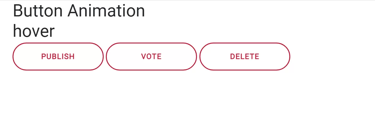
<h2>Button Animation</h2>
<h2>hover</h2>
<div class="button">
<button class="bs-btn btn-hover">Publish</button>
<button class="bs-btn btn-hover">Vote</button>
<button class="bs-btn btn-hover">Delete</button>
</div>
</div>
<!-- container end-->
<!-- Optional JavaScript -->
<!-- jQuery first, then Popper.js, then Bootstrap JS -->
<script src="js/jquery-3.5.1.min.js"></script>
<script src="js/popper.min.js"></script>
<script src="js/bootstrap.min.js"></script>
<script src="js/jquery.min.js"></script>
<script src="js/jquery.js"></script>
</body>
</html>