
 Posted By
Bajarangi soft ,
Posted On 12-10-2020
Posted By
Bajarangi soft ,
Posted On 12-10-2020
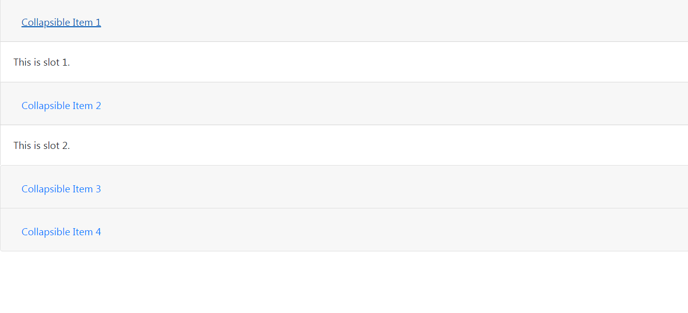
If the control element is targeting a single collapsible element i.e. the data-target attribute is pointing to an “id” selector, then we should add the aria-controls attribute to the control element containing the “id” of the collapsible element. All the collapsible elements under the parent will be closed when the collapsible item is displayed.
Example 1:
<!DOCTYPE html>
<html>

<head>
    <!-- CSS only -->
    <link rel="stylesheet" href=
            "https://stackpath.bootstrapcdn.com/bootstrap/4.5.2/css/bootstrap.min.css" integrity="sha384-JcKb8q3iqJ61gNV9KGb8thSsNjpSL0n8PARn9HuZOnIxN0hoP+VmmDGMN5t9UJ0Z" crossorigin="anonymous">
    <!-- JS, Popper.js, jquery -->
    <script src="https://code.jquery.com/jquery-3.5.1.slim.min.js" integrity="sha384-DfXdz2htPH0lsSSs5nCTpuj/zy4C+OGpamoFVy38MVBnE+IbbVYUew+OrCXaRkfj" crossorigin="anonymous"></script>
    <script src="https://cdn.jsdelivr.net/npm/popper.js@1.16.1/dist/umd/popper.min.js" integrity="sha384-9/reFTGAW83EW2RDu2S0VKaIzap3H66lZH81PoYlFhbGU+6BZp6G7niu735Sk7lN" crossorigin="anonymous"></script>
    <script src="https://stackpath.bootstrapcdn.com/bootstrap/4.5.2/js/bootstrap.min.js" integrity="sha384-B4gt1jrGC7Jh4AgTPSdUtOBvfO8shuf57BaghqFfPlYxofvL8/KUEfYiJOMMV+rV" crossorigin="anonymous"></script>
</head>

<body>
<!-- Accordian wrapper starts -->
<div class="accordion" id="accordionExample">
    <div class="card">
        <!-- Visible portion in collapsed state -->
        <div class="card-header" id="headingOne">
            <h2 class="mb-0">
                <!-- no data-toggle, data-target,
                    aria-expanded, aria-controls
                    attributes are used -->
                <!-- The toggling functionality is lost -->
                <button class="btn btn-link" type="button">
                    Collapsible Item 1
                </button>
            </h2>
        </div>

        <!-- Content to be displayed in open state -->
        <!-- data-parent attribute removed so that
            the cards are not dependent on each other -->
        <div id="collapseOne" class="collapse show"
             aria-labelledby="headingOne">
            <div class="card-body">
                This is slot 1.
            </div>
        </div>
    </div>
    <div class="card">
        <!--visible portion in collapsed state-->
        <div class="card-header" id="headingTwo">
            <h2 class="mb-0">
                <!-- no data-toggle, data-target,
                    aria-expanded, aria-controls
                    attributes are used -->
                <!-- The toggling functionality is lost-->
                <button class="btn btn-link collapsed"
                        type="button">
                    Collapsible Item 2
                </button>
            </h2>
        </div>

        <!-- Content to be displayed in open state -->
        <!-- data-parent attribute removed so that the
            cards are not dependent on each other-->
        <div id="collapseTwo" class="collapse show"
             aria-labelledby="headingTwo">
            <div class="card-body">
                This is slot 2.
            </div>
        </div>
    </div>
    <div class="card">
        <div class="card-header" id="headingThree">
            <h2 class="mb-0">
                <!-- data-toggle, data-target,
                    aria-expanded, aria-controls
                    attributes are used -->
                <!-- As a result the toggling
                    functionality are intact -->
                <button class="btn btn-link collapsed"
                        type="button" data-toggle="collapse"
                        data-target="#collapseThree"
                        aria-expanded="false"
                        aria-controls="collapseThree">
                    Collapsible Item 3
                </button>
            </h2>
        </div>
        <div id="collapseThree" class="collapse"
             aria-labelledby="headingThree"
             data-parent="#accordionExample">
            <div class="card-body">
                This is slot 3.
            </div>
        </div>
    </div>
    <div class="card">
        <div class="card-header" id="headingFour">
            <h2 class="mb-0">
                <!-- data-toggle, data-target, aria-expanded,
                    aria-controls attributes are used -->
                <!-- The toggling functionality are intact -->
                <button class="btn btn-link collapsed"
                        type="button" data-toggle="collapse"
                        data-target="#collapseFour"
                        aria-expanded="false"
                        aria-controls="collapseFour">
                    Collapsible Item 4
                </button>
            </h2>
        </div>
        <div id="collapseFour" class="collapse"
             aria-labelledby="headingFour"
             data-parent="#accordionExample">
            <div class="card-body">
                This is slot 4.
            </div>
        </div>
    </div>
</div>
</body>

</html>
Approach:
The second approach is very similar to the first one except that we create nested accordions and remove the data-toggle attribute for the first two rows. The first two rows have data-parent attribute. If the user wishes to add a collapse feature to the first two rows, add the data-toggle attribute. On click of the first-row, the heading will open up and collapse the second row and vice versa. The first two rows are independent of the last two rows as the data-parent attribute values for the first and second rows.
Example 2:
<!DOCTYPE html>
<html>

<head>

    <!-- CSS only -->
    <link rel="stylesheet" href="https://stackpath.bootstrapcdn.com/bootstrap/4.5.2/css/bootstrap.min.css" integrity="sha384-JcKb8q3iqJ61gNV9KGb8thSsNjpSL0n8PARn9HuZOnIxN0hoP+VmmDGMN5t9UJ0Z" crossorigin="anonymous">

    <!-- JS, Popper.js, jquery and jQuery autocomplete -->
    <script src="https://code.jquery.com/jquery-3.5.1.slim.min.js" integrity="sha384-DfXdz2htPH0lsSSs5nCTpuj/zy4C+OGpamoFVy38MVBnE+IbbVYUew+OrCXaRkfj" crossorigin="anonymous"></script>
    <script src="https://cdn.jsdelivr.net/npm/popper.js@1.16.1/dist/umd/popper.min.js" integrity="sha384-9/reFTGAW83EW2RDu2S0VKaIzap3H66lZH81PoYlFhbGU+6BZp6G7niu735Sk7lN" crossorigin="anonymous"></script>
    <script src="https://stackpath.bootstrapcdn.com/bootstrap/4.5.2/js/bootstrap.min.js" integrity="sha384-B4gt1jrGC7Jh4AgTPSdUtOBvfO8shuf57BaghqFfPlYxofvL8/KUEfYiJOMMV+rV" crossorigin="anonymous">
    </script>
</head>

<body>
<!-- Accordian wrapper starts -->
<div class="accordion" id="accordionExample">
    <div class="card">
        <!-- Visible portion in collapsed state -->
        <div class="card-header" id="headingOne">
            <h2 class="mb-0">
                <!-- data-toggle attribute removed -->
                <button class="btn btn-link" type="button"
                        data-target="#collapseOne"
                        aria-expanded="true"
                        aria-controls="collapseOne">
                    Collapsible Item 1
                </button>
            </h2>
        </div>
        <!--content to be displayed in open state-->
        <div id="collapseOne" class="collapse show"
             aria-labelledby="headingOne"
             data-parent="#accordionExample">
            <div class="card-body">
                This is slot 1.
            </div>
        </div>
    </div>
    <div class="card">
        <!-- Visible portion in collapsed state -->
        <div class="card-header" id="headingTwo">
            <h2 class="mb-0">
                <!--data-toggle attribute removed-->
                <button class="btn btn-link collapsed"
                        type="button" data-target="#collapseTwo"
                        aria-expanded="true"
                        aria-controls="collapseTwo">
                    Collapsible Item 2
                </button>
            </h2>
        </div>
        <!-- Content to be displayed in open state -->
        <div id="collapseTwo" class="collapse show"
             aria-labelledby="headingTwo"
             data-parent="#accordionExample">
            <div class="card-body">
                This is slot 2.
            </div>
        </div>
    </div>
    <!-- nested accordion -->
    <div class="accordion" id="accordionExample1">
        <div class="card">
            <!--visible portion in collapsed state-->
            <div class="card-header" id="headingThree">
                <h2 class="mb-0">
                    <button class="btn btn-link collapsed"
                            type="button" data-toggle="collapse"
                            data-target="#collapseThree"
                            aria-expanded="false"
                            aria-controls="collapseThree">
                        Collapsible Item 3
                    </button>
                </h2>
            </div>
            <!-- Content to be displayed in open state -->
            <div id="collapseThree" class="collapse"
                 aria-labelledby="headingThree"
                 data-parent="#accordionExample1">
                <div class="card-body">
                    This is slot 3.
                </div>
            </div>
        </div>
        <div class="card">

            <!-- Visible portion in collapsed state -->
            <div class="card-header" id="headingFour">
                <h2 class="mb-0">
                    <button class="btn btn-link collapsed"
                            type="button" data-toggle="collapse"
                            data-target="#collapseFour"
                            aria-expanded="false"
                            aria-controls="collapseFour">
                        Collapsible Item 4
                    </button>
                </h2>
            </div>

            <!-- Content to be displayed in open state -->
            <div id="collapseFour" class="collapse"
                 aria-labelledby="headingFour"
                 data-parent="#accordionExample1">
                <div class="card-body">
                    This is slot 4.
                </div>
            </div>
        </div>
    </div>
    <!-- end of nested accordian-->
</div>
</body>

</html>