
 Posted By
Bajarangi soft ,
Posted On 12-10-2020
Posted By
Bajarangi soft ,
Posted On 12-10-2020
1.The following example demonstrate these input groups:
<!DOCTYPE html>

<html>
<head>
    <!-- Include Bootstrap CSS -->
    <link rel="stylesheet" href="https://maxcdn.bootstrapcdn.com/bootstrap/4.0.0/css/bootstrap.min.css">
    <title>Input Groups in Bootstrap</title>
</head>
<body>
<div class="container">
    <h3>Prepend Group Example</h3>

    <!-- Declare an input group -->
    <div class="input-group">

        <!-- Prepend the following content to the input box -->
        <div class="input-group-prepend">

            <!-- Define the text content of the group -->
            <span class="input-group-text" id="username">@</span>
        </div>

        <!-- Declare an input box -->
        <input type="text" class="form-control" placeholder="Username">
    </div>

    <h3>Append Group Example</h3>

    <!-- Declare an input group -->
    <div class="input-group">

        <!-- Declare an input group -->
        <input type="text" class="form-control" placeholder="Email">

        <!-- Prepend the following content to the input box -->
        <div class="input-group-append">

            <!-- Define the text content of the group -->
            <span class="input-group-text" id="email">@example.com</span>
        </div>
    </div>

    <h3>Prepend and Append Together</h3>

    <!-- Declare an input group -->
    <div class="input-group">

        <!-- Prepend the following content to the input box -->
        <div class="input-group-prepend">

            <!-- Define the text content of the group -->
            <span class="input-group-text">https://</span>
        </div>

        <!-- Declare an input group -->
        <input type="text" class="form-control" placeholder="Your domain name here">

        <!-- Append the following content to the input box -->
        <div class="input-group-append">

            <!-- Define the text content of the group -->
            <span class="input-group-text">.com</span>
        </div>
    </div>
</div>
</body>
</html>
The input groups could be made larger or smaller by additional classes. There are 3 possible sizes of input groups:
<!DOCTYPE html>

<html>
<head>
    <!-- Include Bootstrap CSS -->
    <link rel="stylesheet" href="https://maxcdn.bootstrapcdn.com/bootstrap/4.0.0/css/bootstrap.min.css">
    <title>Input Groups in Bootstrap</title>
</head>
<body>
<div class="container">
    <h1>Sizing</h1>

    <!-- Declare the small input group -->
    <div class="input-group input-group-sm mb-3">

        <!-- Prepend the following content to the input box -->
        <div class="input-group-prepend">

            <!-- Define the text content of the group -->
            <span class="input-group-text" id="small">Small</span>
        </div>

        <!-- Declare an input box -->
        <input type="text" class="form-control">
    </div>

    <!-- Declare the normal input group -->
    <div class="input-group mb-3">

        <!-- Prepend the following content to the input box -->
        <div class="input-group-prepend">

            <!-- Define the text content of the group -->
            <span class="input-group-text" id="medium">Default</span>
        </div>

        <!-- Declare an input box -->
        <input type="text" class="form-control">
    </div>

    <!-- Declare the large input group -->
    <div class="input-group input-group-lg">

        <!-- Prepend the following content to the input box -->
        <div class="input-group-prepend">

            <!-- Define the text content of the group -->
            <span class="input-group-text" id="large">Large</span>
        </div>

        <!-- Declare an input box -->
        <input type="text" class="form-control">
    </div>
</div>
</body>
</html>
<!DOCTYPE html>

<html>
<head>
    <!-- Include Bootstrap CSS -->
    <link rel="stylesheet" href="https://maxcdn.bootstrapcdn.com/bootstrap/4.0.0/css/bootstrap.min.css">

    <title>Input Groups in Bootstrap</title>
</head>
<body>
<div class="container">
    <h1>Multiple addons</h1>

    <!-- Declare an input group -->
    <div class="input-group mb-3">

        <!-- Prepend the following content to the input box -->
        <div class="input-group-prepend">

            <!-- Declare two input groups -->
            <span class="input-group-text">$</span>
            <span class="input-group-text">0.00</span>

        </div>
        <!-- Declare an input box -->
        <input type="text" class="form-control">
    </div>

    <!-- Declare an input group -->
    <div class="input-group">

        <!-- Declare an input box -->
        <input type="text" class="form-control">

        <!-- Append the following content to the input box -->
        <div class="input-group-append">

            <!-- Declare two input texts -->
            <span class="input-group-text">$</span>
            <span class="input-group-text">0.00</span>
        </div>
    </div>
</div>
</body>
</html>
<!DOCTYPE html>
<html>
<head>
<!-- Include Bootstrap CSS -->
<link rel="stylesheet" href="https://maxcdn.bootstrapcdn.com/bootstrap/4.0.0/css/bootstrap.min.css">
<title>Input Groups in Bootstrap</title>
</head>
<body>
<div class="container">
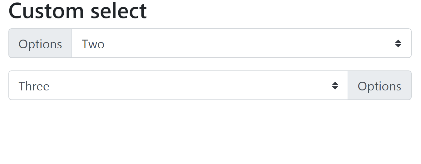
<h3>Custom select</h3>
<div class="input-group mb-3">
<div class="input-group-prepend">
<label class="input-group-text" for="select01">Options</label>
</div>
<select class="custom-select" id="select01">
<option selected>Choose...</option>
<option value="1">One</option>
<option value="2">Two</option>
<option value="3">Three</option>
</select>
</div>
<div class="input-group mb-3">
<select class="custom-select" id="select02">
<option selected>Choose...</option>
<option value="1">One</option>
<option value="2">Two</option>
<option value="3">Three</option>
</select>
<div class="input-group-append">
<label class="input-group-text" for="select02">Options</label>
</div>
</div>
</div>
<script src="https://code.jquery.com/jquery-3.2.1.slim.min.js"></script>
<script src="https://cdnjs.cloudflare.com/ajax/libs/popper.js/1.12.9/umd/popper.min.js"></script>
<script src="https://maxcdn.bootstrapcdn.com/bootstrap/4.0.0/js/bootstrap.min.js"></script>
</body>
</html>