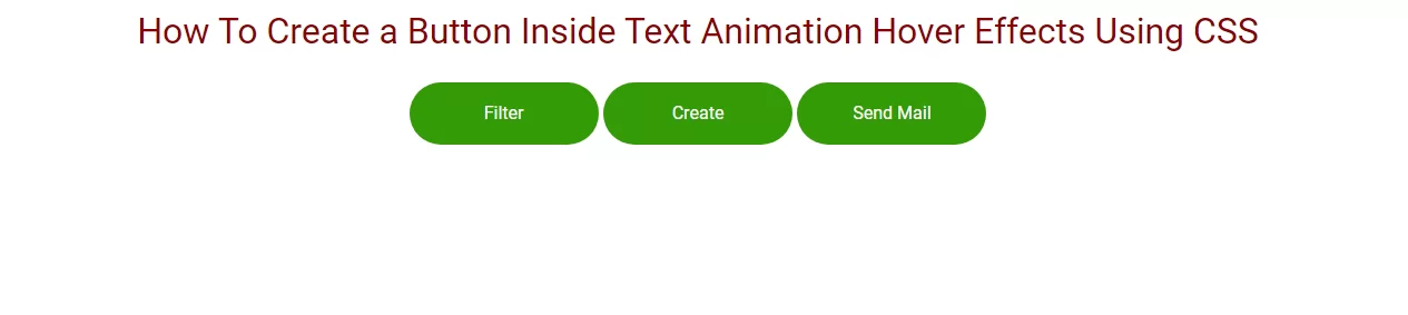
How To Create a Button Inside Text Animation Hover Effects Using CSS Part-1
 Posted By
Bajarangi soft
Posted By
Bajarangi soft ,
Posted On 28-01-2021
we can create button text animated with hover effect.A Simple Way to Create a Hover Animation for Your Buttons Using CSS. Here You can see we make hover effects in buttons.
Step 1:Create css file like style.css
@import url("https://fonts.googleapis.com/css2?family=Roboto:ital,wght@0,100;0,300;0,400;1,100;1,300&family=Slabo+27px&display=swap");
*::after,
*::before {
box-sizing: border-box;
}
html {
scroll-behavior: smooth;
}
body {
margin: 0px;
padding: 0px;
}
ul,
li {
margin: 0px;
padding: 0px;
list-style: none;
font-family: "Roboto", sans-serif;
font-style: normal;
}
h1,
h2,
h3,
h4,
h5,
h6 {
margin: 0px;
padding: 0px;
font-weight: 500;
font-family: "Roboto", sans-serif;
font-style: normal;
}
p {
margin: 0px;
padding: 0px;
font-family: "Roboto", sans-serif;
font-style: normal;
}
table,
thead,
tbody,
tr,
th,
td {
font-family: "Roboto", sans-serif;
font-style: normal;
}
hr {
margin: 0px;
padding: 0px;
}
input,
button,
select,
optgroup,
textarea {
font-family: "Roboto", sans-serif;
font-style: normal;
}
a,
strong,
label,
span,
img,
b {
font-family: "Roboto", sans-serif;
transition: all 0.3s ease 0s;
font-style: normal;
}
a,
a:hover,
a:focus,
a:active,
a:link {
outline: none;
text-decoration: none;
color: #000;
}
a.bs-btn:focus {
outline: 0;
box-shadow: none;
}
button.bs-btn:focus {
outline: 0;
box-shadow: none;
}
.text-center{
color:darkred;
}
Step 2:Create html file and import style.css in it.
<!DOCTYPE html>
<html lang="en">
<head>
<!-- Required meta tags -->
<title>animaion button hover one</title>
<meta charset="utf-8" />
<meta name="viewport" content="width=device-width, initial-scale=1, shrink-to-fit=no" />
<!-- Bootstrap CSS -->
<link rel="stylesheet" href="https://maxcdn.bootstrapcdn.com/bootstrap/4.0.0/css/bootstrap.min.css">
<link rel="stylesheet" href="https://cdnjs.cloudflare.com/ajax/libs/font-awesome/4.7.0/css/font-awesome.min.css">
<link rel="stylesheet" type="text/css" href="css/style.css" />
<style type="text/css">
button.bs-btn {
position: relative;
display: inline-block;
min-width: 170px;
max-width: 170px;
background: #339b07;
vertical-align: middle;
-webkit-backface-visibility: hidden;
-moz-osx-font-smoothing: grayscale;
font-weight: 500;
font-size: 16px;
border-radius: 40px;
border: none;
cursor: pointer;
color: #fff;
z-index: 1;
margin: 3px 0px;
}
button.bs-btn:focus {
outline: none;
}
button.bs-btn > span {
vertical-align: middle;
}
button.bs-btn.btn-hover {
padding: 0;
overflow: hidden;
-webkit-transition: background-color 0.3s;
transition: background-color 0.3s;
}
button.bs-btn.btn-hover > span {
display: inline-block;
padding: 1em 0;
}
button.bs-btn.btn-hover:hover {
background-color: #c21713;
}
button.bs-btn.btn-hover:hover > span:nth-child(odd) {
-webkit-animation: anim-hover-1 0.5s forwards;
animation: anim-hover-1 0.5s forwards;
}
button.bs-btn.btn-hover:hover > span:nth-child(even) {
-webkit-animation: anim-hover-2 0.5s forwards;
animation: anim-hover-2 0.5s forwards;
}
button.bs-btn.btn-hover:hover > span:nth-child(odd),
button.bs-btn.btn-hover:hover > span:nth-child(even) {
-webkit-animation-timing-function: cubic-bezier(0.75, 0, 0.125, 1);
transition-animation-function: cubic-bezier(0.75, 0, 0.125, 1);
}
@-webkit-keyframes anim-hover-1 {
0%,
100% {
opacity: 1;
-webkit-transform: translate3d(0, 0, 0);
transform: translate3d(0, 0, 0);
}
49% {
opacity: 1;
-webkit-transform: translate3d(0, 100%, 0);
transform: translate3d(0, 100%, 0);
}
50% {
opacity: 0;
-webkit-transform: translate3d(0, 100%, 0);
transform: translate3d(0, 100%, 0);
color: inherit;
}
51% {
opacity: 0;
-webkit-transform: translate3d(0, -100%, 0);
transform: translate3d(0, -100%, 0);
color: #fff;
}
100% {
color: #fff;
}
}
@keyframes anim-hover-1 {
0%,
100% {
opacity: 1;
-webkit-transform: translate3d(0, 0, 0);
transform: translate3d(0, 0, 0);
}
49% {
opacity: 1;
-webkit-transform: translate3d(0, 100%, 0);
transform: translate3d(0, 100%, 0);
}
50% {
opacity: 0;
-webkit-transform: translate3d(0, 100%, 0);
transform: translate3d(0, 100%, 0);
color: inherit;
}
51% {
opacity: 0;
-webkit-transform: translate3d(0, -100%, 0);
transform: translate3d(0, -100%, 0);
color: #fff;
}
100% {
color: #fff;
}
}
@-webkit-keyframes anim-hover-2 {
0%,
100% {
opacity: 1;
-webkit-transform: translate3d(0, 0, 0);
transform: translate3d(0, 0, 0);
}
49% {
opacity: 1;
-webkit-transform: translate3d(0, -100%, 0);
transform: translate3d(0, -100%, 0);
}
50% {
opacity: 0;
-webkit-transform: translate3d(0, -100%, 0);
transform: translate3d(0, -100%, 0);
color: inherit;
}
51% {
opacity: 0;
-webkit-transform: translate3d(0, 100%, 0);
transform: translate3d(0, 100%, 0);
color: #fff;
}
100% {
color: #fff;
}
}
@keyframes anim-hover-2 {
0%,
100% {
opacity: 1;
-webkit-transform: translate3d(0, 0, 0);
transform: translate3d(0, 0, 0);
}
49% {
opacity: 1;
-webkit-transform: translate3d(0, -100%, 0);
transform: translate3d(0, -100%, 0);
}
50% {
opacity: 0;
-webkit-transform: translate3d(0, -100%, 0);
transform: translate3d(0, -100%, 0);
color: inherit;
}
51% {
opacity: 0;
-webkit-transform: translate3d(0, 100%, 0);
transform: translate3d(0, 100%, 0);
color: #fff;
}
100% {
color: #fff;
}
}
button.bs-btn.btn-hover:hover > span:nth-child(1) {
-webkit-animation-delay: 0s;
animation-delay: 0s;
}
button.bs-btn.btn-hover:hover > span:nth-child(2) {
-webkit-animation-delay: 0.05s;
animation-delay: 0.05s;
}
button.bs-btn.btn-hover:hover > span:nth-child(3) {
-webkit-animation-delay: 0.1s;
animation-delay: 0.1s;
}
button.bs-btn.btn-hover:hover > span:nth-child(4) {
-webkit-animation-delay: 0.15s;
animation-delay: 0.15s;
}
button.bs-btn.btn-hover:hover > span:nth-child(5) {
-webkit-animation-delay: 0.2s;
animation-delay: 0.2s;
}
button.bs-btn.btn-hover:hover > span:nth-child(6) {
-webkit-animation-delay: 0.25s;
animation-delay: 0.25s;
}
button.bs-btn.btn-hover:hover > span:nth-child(7) {
-webkit-animation-delay: 0.3s;
animation-delay: 0.3s;
}
button.bs-btn.btn-hover:hover > span:nth-child(8) {
-webkit-animation-delay: 0.35s;
animation-delay: 0.35s;
}
button.bs-btn.btn-hover:hover > span:nth-child(9) {
-webkit-animation-delay: 0.4s;
animation-delay: 0.4s;
}
button.bs-btn.btn-hover:hover > span:nth-child(10) {
-webkit-animation-delay: 0.45s;
animation-delay: 0.45s;
}
button.bs-btn.btn-hover:hover > span:nth-child(11) {
-webkit-animation-delay: 0.5s;
animation-delay: 0.5s;
}
@media (max-width: 768px) {
button.bs-btn {
min-width: 150px;
max-width: 150px;
}
}
</style>
</head>
<body>
<!-- container -->
<div class="container">
<h2>Button Animation</h2>
<h2>hover</h2>
<div class="button">
<button class="bs-btn btn-hover"><span>F</span><span>i</span><span>l</span><span>t</span><span>e</span><span>r</span></button>
<button class="bs-btn btn-hover"><span>C</span><span>r</span><span>e</span><span>a</span><span>t</span><span>e</span></button>
<button class="bs-btn btn-hover"><span>S</span><span>e</span><span>n</span><span>d</span> <span>M</span><span>a</span><span>i</span><span>l</span></button>
</div>
</div>
<!-- container end-->
<!-- Optional JavaScript -->
<!-- jQuery first, then Popper.js, then Bootstrap JS -->
<script src="https://code.jquery.com/jquery-3.2.1.slim.min.js"></script>
<script src="https://cdnjs.cloudflare.com/ajax/libs/popper.js/1.12.9/umd/popper.min.js"></script>
<script src="https://maxcdn.bootstrapcdn.com/bootstrap/4.0.0/js/bootstrap.min.js"></script>
</body>
</html>