How To create a Animated Buttons Text Change With Hover Effects Using Css
 Posted By
Bajarangi soft
Posted By
Bajarangi soft ,
Posted On 28-01-2021
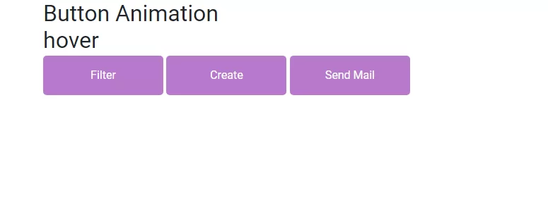
A simple button is elevated using CSS and HTML adding an attractive glow effect,Using css styles here we are going to create Buttons Change With Hover Effects Using Css.
Step 1:Create css file like style.css
@import url("https://fonts.googleapis.com/css2?family=Roboto:ital,wght@0,100;0,300;0,400;1,100;1,300&family=Slabo+27px&display=swap");
*::after,
*::before {
box-sizing: border-box;
}
html {
scroll-behavior: smooth;
}
body {
margin: 0px;
padding: 0px;
}
ul,
li {
margin: 0px;
padding: 0px;
list-style: none;
font-family: "Roboto", sans-serif;
font-style: normal;
}
h1,
h2,
h3,
h4,
h5,
h6 {
margin: 0px;
padding: 0px;
font-weight: 500;
font-family: "Roboto", sans-serif;
font-style: normal;
}
p {
margin: 0px;
padding: 0px;
font-family: "Roboto", sans-serif;
font-style: normal;
}
table,
thead,
tbody,
tr,
th,
td {
font-family: "Roboto", sans-serif;
font-style: normal;
}
hr {
margin: 0px;
padding: 0px;
}
input,
button,
select,
optgroup,
textarea {
font-family: "Roboto", sans-serif;
font-style: normal;
}
a,
strong,
label,
span,
img,
b {
font-family: "Roboto", sans-serif;
transition: all 0.3s ease 0s;
font-style: normal;
}
a,
a:hover,
a:focus,
a:active,
a:link {
outline: none;
text-decoration: none;
color: #000;
}
a.bs-btn:focus {
outline: 0;
box-shadow: none;
}
button.bs-btn:focus {
outline: 0;
box-shadow: none;
}
.text-center{
color:darkred;
}
Step 2:Create html file and import style.css in it.
<!DOCTYPE html>
<html lang="en">
<head>
<!-- Required meta tags -->
<title>animaion button three</title>
<meta charset="utf-8" />
<meta name="viewport" content="width=device-width, initial-scale=1, shrink-to-fit=no" />
<!-- Bootstrap CSS -->
<link rel="stylesheet" href="https://maxcdn.bootstrapcdn.com/bootstrap/4.0.0/css/bootstrap.min.css">
<link rel="stylesheet" href="https://cdnjs.cloudflare.com/ajax/libs/font-awesome/4.7.0/css/font-awesome.min.css">
<link rel="stylesheet" type="text/css" href="css/style.css" />
<style type="text/css">
button.bs-btn:focus {
outline: 0;
box-shadow: none;
}
button.bs-btn {
position: relative;
display: inline-block;
min-width: 170px;
max-width: 170px;
background: #000;
padding: 6px 0px;
box-shadow: 0px 0px 17px 1px rgba(0, 0, 0, 0.34);
border-radius: 0;
border: none;
cursor: pointer;
z-index: 1;
margin: 3px 0px;
}
button.bs-btn span {
color: #fff;
display: block;
text-transform: uppercase;
font-size: 16px;
font-weight: 600;
transform: scaleX(0.6);
line-height: 40px;
letter-spacing: 2px;
transform-origin: center left;
transition: color 0.3s ease;
position: relative;
z-index: 1;
}
button.bs-btn em {
position: absolute;
height: 1px;
background: #fff;
width: 47%;
right: 23px;
top: 50%;
transform: scaleX(0.25);
transform-origin: center right;
transition: all 0.3s ease;
z-index: 1;
}
button.bs-btn:before,
button.bs-btn:after {
content: "";
background: #fff;
height: 50%;
width: 0;
position: absolute;
transition: 0.3s cubic-bezier(0.785, 0.135, 0.15, 0.86);
}
button.bs-btn:before {
top: 0;
left: 0;
right: auto;
}
button.bs-btn:after {
bottom: 0;
right: 0;
left: auto;
}
button.bs-btn:hover:before {
width: 100%;
right: 0;
left: auto;
}
button.bs-btn:hover:after {
width: 100%;
left: 0;
right: auto;
}
button.bs-btn:hover span {
color: #000;
}
button.bs-btn:hover em {
background: #000;
transform: scaleX(0.5);
}
@media (max-width: 768px) {
button.bs-btn {
min-width: 150px;
max-width: 150px;
}
}
</style>
</head>
<body>
<!-- container -->
<div class="container">
<br>
<div class="button text-center">
<h2 class="text-center">How To create a Buttons Change With Hover Effects Using Css</h2>
<br>
<button class="bs-btn"><span>hover </span><em></em></button>
<button class="bs-btn"><span>hover</span><em></em></button>
<button class="bs-btn"><span>hover</span><em></em></button>
</div>
</div>
<!-- container end-->
<!-- Optional JavaScript -->
<!-- jQuery first, then Popper.js, then Bootstrap JS -->
<script src="https://code.jquery.com/jquery-3.2.1.slim.min.js"></script>
<script src="https://cdnjs.cloudflare.com/ajax/libs/popper.js/1.12.9/umd/popper.min.js"></script>
<script src="https://maxcdn.bootstrapcdn.com/bootstrap/4.0.0/js/bootstrap.min.js"></script>
</body>
</html>