
 Posted By
Bajarangi soft ,
Posted On 27-11-2020
Posted By
Bajarangi soft ,
Posted On 27-11-2020
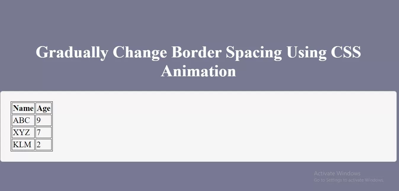
Complete Code For Gradually Change Border Spacing Using CSS Animation.
<!DOCTYPE html>
<html>
<head>
    <title>How Gradually Change Border Spacing Using CSS Animation</title>
    <meta name="viewport" content="width=device-width, initial-scale=1.0">
</head>

<style>
    * {
        box-sizing: border-box;
    }

    body {
        background-color: #777891;
    }
    .text-center{
        text-align: center;
    }
    .well {
        min-height: 20px;
        padding: 19px;
        margin-bottom: 20px;
        background-color: #f5f5f5;
        border: 1px solid #e3e3e3;
        border-radius: 4px;
        -webkit-box-shadow: inset 0 1px 1px rgba(0,0,0,.05);
        box-shadow: inset 0 1px 1px rgba(0,0,0,.05);
    }
    #myTABLE, th, td {
        border: 1px solid black !important;
    }

    #myTABLE {
        border-spacing: 2px;
        animation: mymove 5s infinite;
    }

    @keyframes mymove {
        50% {border-spacing: 20px;}
    }
</style>
<body>
<br/><br/>
<div class="container">
    <br>
    <div class="text-center">
        <h1 id="color" style="color: white;"> Gradually Change Border Spacing Using CSS Animation</h1>
    </div>
    <div class="well">
        <table id="myTABLE">
            <tr>
                <th>Name</th>
                <th>Age</th>
            </tr>
            <tr>
                <td>ABC</td>
                <td>9</td>
            </tr>
            <tr>
                <td>XYZ</td>
                <td>7</td>
            </tr>
            <tr>
                <td>KLM</td>
                <td>2</td>
            </tr>
        </table>
    </div>
</div>
</body>
</html>